Cool. Commercial. Unmistakeable.

Holland Cotter, The New York Times, 18 October 2012, Visit External Site
The exhibition includes “TorpedoLos!,” center, and “Varoom!” to its immediate left.Credit...Brendan Hoffman for The New York Times

WASHINGTON — Like a champion gymnast perfecting a winning routine, Roy Lichtenstein developed a deft, tight, virtually foolproof art style, one that was based on agility rather than brawn and, though narrow in range, was capable of surprising variations and extensions.

The look of this art isn’t big, but it’s smart; cool and dry, but accessible. Connoisseurs and know-nothings alike can enjoy it, and for some of the same reasons. And there’s the recognition factor: very high. Once you’ve encountered his work, you’d know it anywhere. Catch a glimpse of a Lichtenstein out of the corner of your eye from a moving cab, and it will register, half-seen.

“Roy Lichtenstein: A Retrospective,” a traveling exhibition now at the National Gallery of Art here, is the first major survey of his work since his death, at 73, in 1997. It’s a big show and has a few slow spots, but on the whole it moves right along. Its 14 thematic sections have been edited with less-is-more dispatch. There aren’t many labels to detain you. Most important, Lichtenstein’s large-featured images, with their Ben-Day dot patterns; thick, black contours; and flat, bright colors are almost ergonomically comfortable to the eye.

Lichtenstein, born and raised in Manhattan, was focused on art from the start. Barely out of high school, he enrolled at the Art Students League and studied painting with Reginald Marsh. After a three-year Army stint during World War II, he earned an M.F.A. from Ohio State University, and worked here and there before moving to New Jersey in 1960, then back to New York City the following year.

Like almost everyone else, he had been turning out brushy paintings — there are a few in the show — in an Abstract Expressionist vein. But by 1960, that model felt style-cramping and uncool. There had to be other options, and he found one: he started painting cartoons.

The earliest example, “Look Mickey,” from 1961, is the first thing you see in the exhibition: a picture of Donald Duck and Mickey Mouse, adapted from a Disney children’s book.

Lichtenstein would later say that he painted it for his kids. In reality, he painted it for himself, to get as far away as possible from where he’d been.

 
He kept going in this new direction. He clipped ordinary images — a hot dog, a pair of Keds, a manicured female hand doing housework — from tabloid newspapers, comic strips and advertisements; made drawings of the images; transferred those drawings, enlarged, to canvases; and painted them. He set everything in the paintings against fields of Ben-Day dot patterns to suggest the look of cheap commercial printing, initially creating the patterns with a dog’s grooming brush dipped in paint. 

What he was making, of course, was Pop Art. He didn’t invent it, but he was quickly pegged as one of its defining exponents, and his career took off. In 1961, through a fellow artist, he met the dealer Leo Castelli, who agreed to represent him, and immediately added him to a group show of other stars on the rise, including Jasper Johns, Robert Rauschenberg and Frank Stella. Andy Warhol would soon join the team.

Lichtenstein’s first Castelli solo, in 1962, sold out before it opened. He was clearly at the beginning of a heady ride, though he experienced it largely from the perspective of his studio, where he spent most of his time, refining and toning the formal aspects of his art and judiciously expanding its repertory of themes. He became comfortable working in thematic series, keeping several in progress at once.

In the early 1960s he continued to paint everyday objects, but switched from color to black and white. He also moved from Disney comics to a romantic genre produced by DC Comics, from which he adapted a line of close-up images of the faces of lovelorn, emoting young women. The 1963 “Drowning Girl” become one of his best-known pictures.

By this time, too, he was attracting disapproval. His work was criticized for being lightweight, nostalgic, uncritical, conservative: pseudo-populist art for the carriage trade. With the Vietnam War moving into high gear, and resistance at home on the boil, the perceived ideological defects of his art seemed particularly glaring.

In response, he might have pointed — maybe he did — to yet another of his series derived from DC Comics, this one made up of billboard-size paintings of fighter-plane battles, and jagged wall reliefs in the form of exploding bombs. Hung together, floor to ceiling, they add up to the show’s most dynamic installation. And while they may not exactly be “political art,” they don’t read as Pop jokes, either.

Lichtenstein was adamant about keeping personal content out of his work. But surely, at some level, this series, if not a response to the Vietnam War, reflects his own experience of World War II — he had been posted at an antiaircraft training base — and the threat of nuclear catastrophe that haunted America in the postwar years.

By the mid-1960s Pop Art, after its short, flaring, emphatic moment, was itself becoming part of the past.

Lichtenstein saw this and began adjusting his work accordingly. He couldn’t do much to its basic form; the defining elements — dots, lines, color — were by now unalterable. What he could change was content, and, with mixed success, he did.

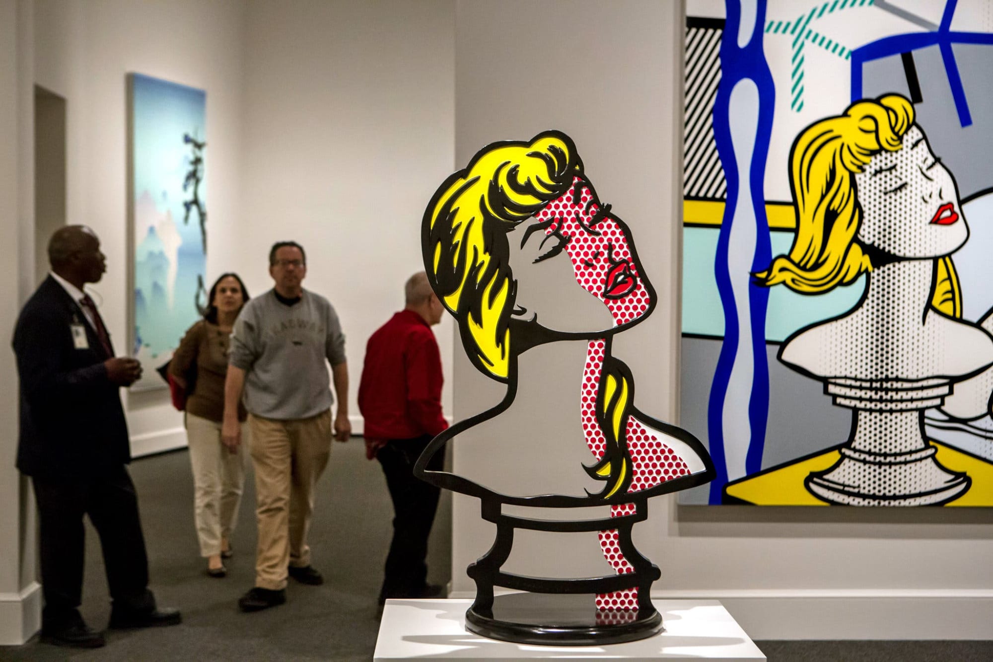
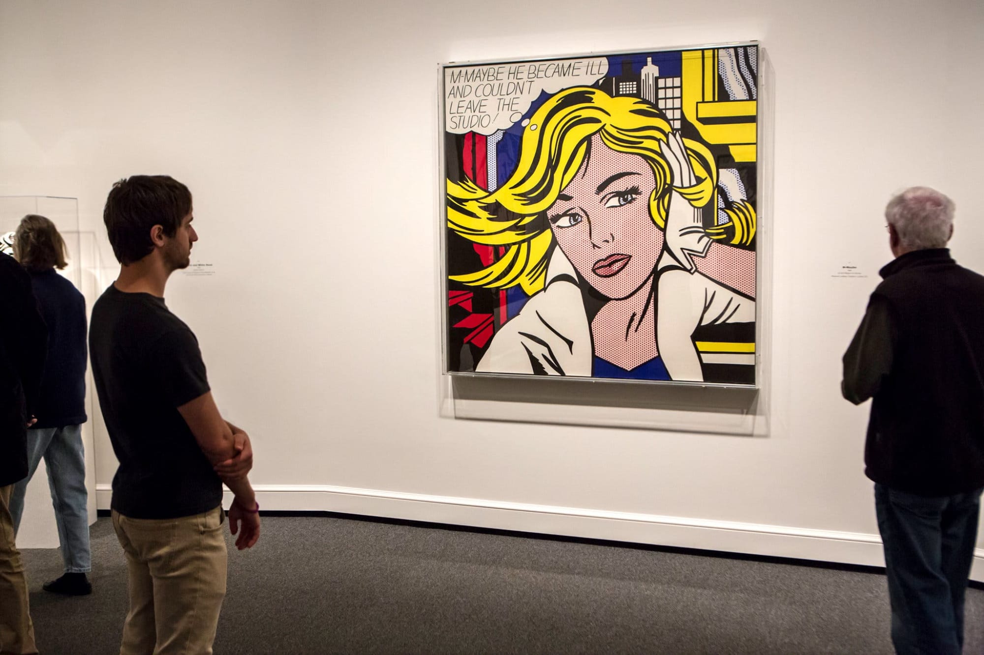
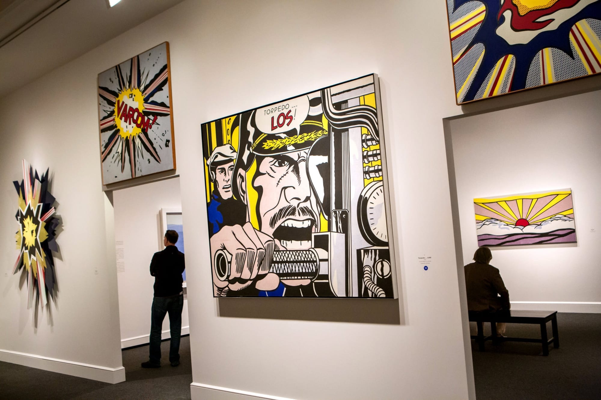
Cartoon figures went out; cartoonish still lifes and art historical homages came in. The still lifes are clever, if slight; the homages, which stretch over many years, admirably diverse but unrevealing. The most elaborate are dedicated to Picasso, a Lichtenstein hero, and seem intended as affectionate spoofs. But they add nothing to the many spoofs, intended or not, that Picasso did of himself. Over all, the work gives little reason to consider an old view of Lichtenstein, as a spectacularly gifted lightweight, inapt.

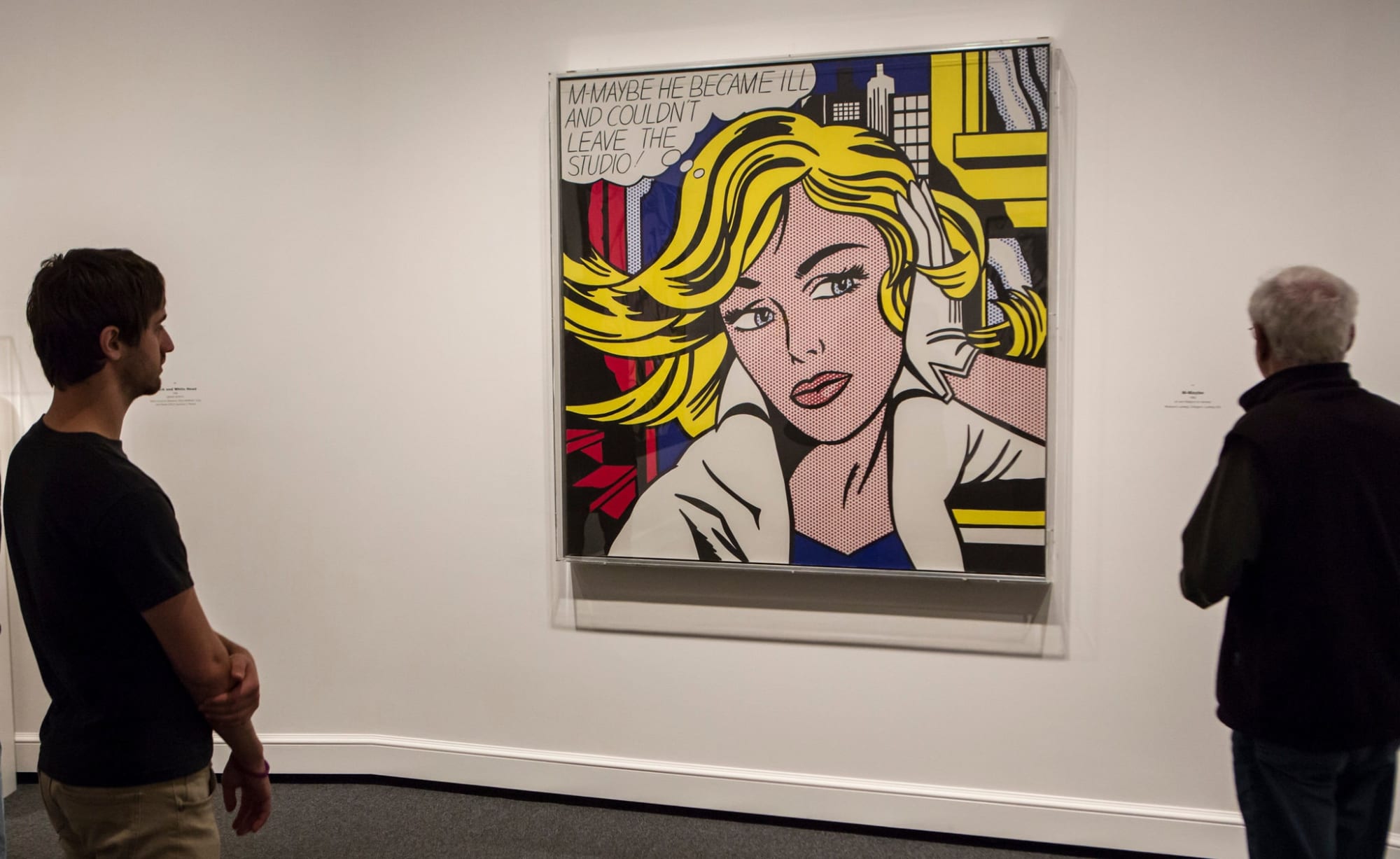
But there are more interesting things ahead, among them the four large 1974 paintings collectively titled “Artist’s Studio.” Inspired by Matisse’s “Red Studio” and “Pink Studio,” these are near-walk-in-size depictions of rooms, or maybe one room, empty of people but filled with art. A connection to Lichtenstein’s other artist tributes is obvious. But in this case he has cooked up a self homage. Matisse and Picasso are on hand, but what we’re really getting is a jumbled and informal four-part Lichtenstein survey, beginning with “Look Mickey,” and going from there.

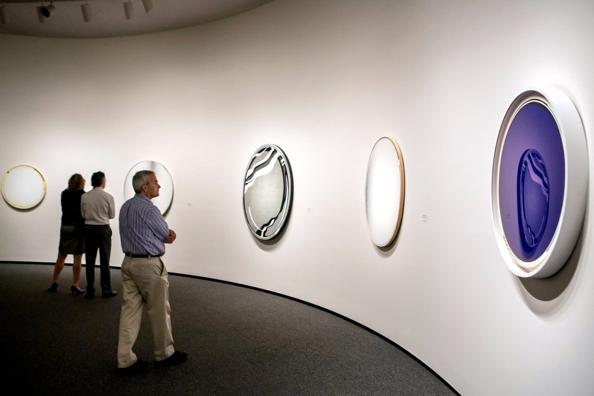
Chances are that only an artist whose work is as determinedly egoless as Lichtenstein’s could get away with such a salute to self, and even make it moving, which he does, tapping a strain of vulnerability and poignancy in his art that is otherwise hard to locate. It’s there, however, in six beautiful paintings of reflectionless mirrors installed, side by side, like icons, on one curving wall in the show.


And it’s there in the paintings called “Landscapes in the Chinese Style,” the last series he completed before he died. It’s a tribute, too, to the great nature painters of China’s Song dynasty (A.D. 960-1279), whom Lichtenstein learned about in art school and never forgot. Now, at the end, they push him to stretch himself, experiment, try new moves and retry old ones.

In one painting he swipes thick white paint in strong strokes across the canvas to evoke a gathered fog. In another, he makes his ever-present dot pattern do the equivalent of a slow tonal fade, as if the landscape were dissolving into a molecular mist.

These dexterous, assured, balance-defying performances give a glow to the end of the show, which has been organized by James Rondeau of the Art Institute of Chicago (where it originated earlier this year), Sheena Wagstaff of the Metropolitan Museum of Art and Harry Cooper, curator of the National Gallery of Art. But they still leave Lichtenstein’s status in the historical scheme of things unresolved.

It’s impossible not to compare him with Warhol, his Pop compatriot. Warhol not only radically changed art, but he changed America too. Lichtenstein changed art to some extent, but nothing else. The Warhol effect remains strong and pervasive. I’m not sure there is, or ever was, a Lichtenstein effect.

Yet his work looks like no one else’s, and some of it still feels fresh and audacious. He encapsulates, at least in his early work, the spirit of an era. He is embedded in the culture now, and unlikely to be dislodged.

Let’s call him an American classic, and leave it at that.


ROY LICHTENSTEIN:

A RETROSPECTIVE

WHEN AND WHERE Through Jan. 13, 2013. National Gallery of Art, on the National Mall, between Third and Seventh Streets, at Constitution Avenue N.W., Washington.


Among the pieces in the exhibition is “M-Maybe,” from 1965.Credit...Brendan Hoffman for The New York Times

From left: “Mirror #5,” “Mirror #1,” “Mirror #1,” “Mirror #1” and “Mirror #6.”

Brendan Hoffman for The New York Times

“Connoisseurs and know-nothings alike can enjoy it, and for some of the same reasons.”

“Woman: Sunlight, Moonlight,” center, and a detail of “Nude With Bust,” right.

Brendan Hoffman for The New York Times

“The look of this art isn’t big, but it’s smart; cool and dry, but accessible.”

“As I Opened Fire,” left, and “Explosion II.”

Brendan Hoffman for The New York Times

Holland Cotter writes: “Like a champion gymnast perfecting a winning routine, Roy Lichtenstein developed a deft, tight, virtually foolproof art style, one that was based on agility rather than brawn and, though narrow in range, was capable of surprising variations and extensions.”

“Wall Explosion II”

“There aren’t many labels to detain you. Most important, Lichtenstein’s large-featured images, with their Ben-Day dot patterns; thick, black contours; and flat, bright colors are almost ergonomically comfortable to the eye.”

A portion of “Imperfect Painting (Gold),” left, “Imperfect Sculpture,” center, and “Perfect Painting.”

“It’s a big show and has a few slow spots, but on the whole it moves right along. Its 14 thematic sections have been edited with less-is-more dispatch.” 

“Haystack,” left, “Archaic Head VI,” center, and “George Washington.” 

Brendan Hoffman for The New York Times

“Rouen Cathedral, Set 5.”

Brendan Hoffman for The New York Times

"And there’s the recognition factor: very high. Once you’ve encountered his work, you’d know it anywhere. Catch a glimpse of a Lichtenstein out of the corner of your eye from a moving cab, and it will register, half-seen.”

“M-Maybe”

Brendan Hoffman for The New York Times